I asked one of my lecturers about doing text visualisation as my masters thesis and he said it sounded great, even emailed me a paper to read! I don’t have an exact question yet, but it’ll be something along the lines of visualising web browser history. I’m quite excited about it weeee! I’ll have to find out from actual forensic investigators how they use browser history and what they search for to see what is best visualised. Might be able to extend it to general log files, depends on what I find out! The result would hopefully be to produce a program (probably a web app with fancy ajax) that visualises the output of Pasco/WebHistorian etc effectively.
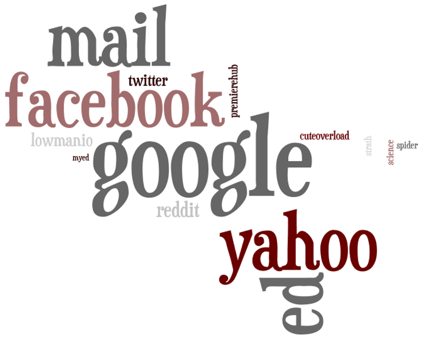
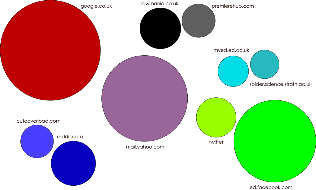
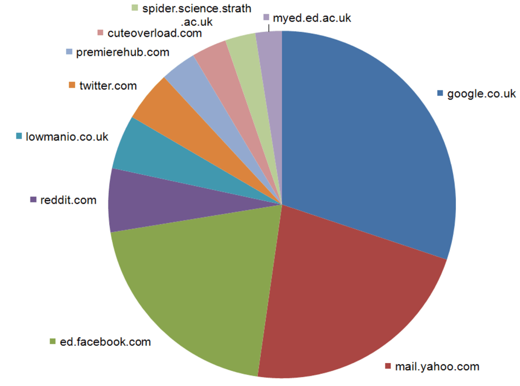
Anyway, I got a bit excited about this today, and make three very different visualizations of the top ten websites I visited in September. They all show the ten websites weighted according to how often I visited them. I’m interested to know which is most appealing and why?